Landing page examples
Real-world Landing page examples pulled from complete funnels, each in the context that makes it work.
56 examples
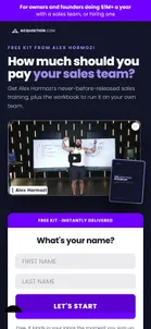
- Acquisition.com — The kit pageDark, single-purpose, with the form in the first screen. The strapline narrows the audience twice, "for owners and founders doing $1M+ a year, with a sales team, or hiring one", and then lists what is inside: the training (21 minutes 42 seconds), a Sales Comp Builder, a Recruiting Budget, a Group Interview Funnel and a Career Ladder. Each tool gets its own "question it answers" block further down, followed by Google reviews of the Scaling Workshop. Nothing on the page offers the workshop or a call; the workshop appears only as the source of the reviews.View asset →

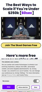
- Acquisition.com — "If you're under $100k" — the branch that stops sellingThe page for everyone who answered "under $100k". There is no pitch, no booking widget, and nothing for sale. Instead it hands over the complete $100M Leads System — eight modules, a video, the Skool Games — under the line "Access everything below with one simple click. No opt-in required." The person too small to sell to receives strictly more than the person being sold to. Read as generosity it is disarming; read as mechanics it is a cheap way to keep a future buyer warm for the years before they qualify.View asset →
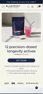
- Blueprint — Longevity Mix Actives — hero and benefitsAn 11,841px page that opens on "12 precision-dosed longevity actives" — a smaller number than the ad's "over 20", which is an unusual direction for a promise to move. Three proof bullets, a press wall (VICE, GQ, VOGUE, The Washington Post) and six benefit tiles that each name the active responsible, so the mechanism is stated rather than implied. "Trust data, not vibes" follows with two statistics, though one of them ("90% of adults don't get enough nutrients") sits a few screens from a second, unrelated 90% claim about supplement mislabeling.View asset →
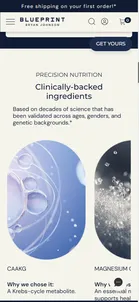
- Blueprint — Clinically-backed ingredients + founder proofA swipeable carousel of thirteen actives, each with its own "Why we chose it:" line — the page's most substantial section, and the one doing the real work of justifying the price. It is followed immediately by "Bryan Johnson takes this daily", which tells the origin story as a simplification ("he was taking over 100 pills a day. To simplify the protocol, we packed 13 Longevity Actives into a daily drink"). Note the count drifting again: the hero says 12, this carousel holds 13.View asset →
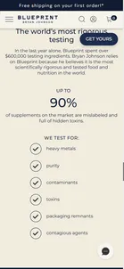
- Blueprint — "The world's most rigorous testing"Category-level fear, handled well: "UP TO 90% of supplements on the market are mislabeled and full of hidden toxins", answered with a spend figure ($600,000 on ingredient testing in the last year) and a six-item list of what is tested for. The framing is worth noting — "Bryan Johnson relies on Blueprint because he believes it is the most scientifically rigorous food and nutrition in the world" cites the owner of the company in the third person, as though he were an independent authority endorsing it.View asset →
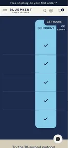
- Blueprint — "How We Measure Up" — broken on mobileA live defect worth studying, because it destroys the section on the exact surface the ads target. On desktop the table reads properly: five labelled rows — transparent third-party testing, consumed by Bryan Johnson, clinically-backed ingredients, study-level precision doses, no fillers — against two competitors. On mobile the entire label column is absent from the rendered table, and the table is 546px wide inside a 390px viewport with no scrollbar or visual hint that it scrolls. The mobile visitor's default view is a single column of checkmarks compared against nothing at all. Every ad in this set runs Facebook and Instagram placements.View asset →
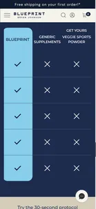
- Blueprint — The same table, swiped rightWhat the mobile visitor finds only by guessing that the table scrolls — two competitor columns of crosses, still with no row labels to say what is being compared. The sticky "GET YOURS" pill also lands on the "VEGGIE SPORTS POWDER" header. Included beside the default view because the pair is the finding: this is a persuasive asset that persuades nobody on the device it is served to.View asset →
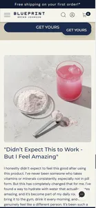
- Blueprint — 30-second protocol, testimonial and FAQThe closing run — an ease-of-use section, one long first-person testimonial from a Verified Buyer, and a five-item FAQ covering contents, dosing, suitability, shipping and returns. Also the clearest view of a second defect: the sticky "GET YOURS" pill collides with the page's own inline "GET YOURS" button, rendering two overlapping copies of the same control.View asset →
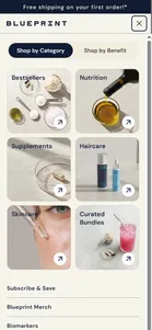
- Blueprint — "Take the Quiz" — desktop nav onlyThe entry point, and the funnel's first surprise: no ad points here. A 40-ad Facebook Ad Library scrape of the same brand resolved to five destinations, every one a product page — this quiz gets no paid traffic at all. What it gets instead is the most prominent button on the desktop site, a solid navy pill among four plain text links. The two images are deliberately paired: the mobile nav on the left has no quiz in it, because all nine quiz links on the homepage sit inside a `.featured-blocks.desktop` container that is display:none below the desktop breakpoint. So a funnel with no paid traffic is also invisible to every phone. The nav CTA also points at /pages/find-my-protocol rather than /pages/protocol-quiz — two self-canonical, indexable URLs serving the identical quiz.View asset →
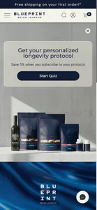
- Blueprint — Quiz landing ("Get your personalized longevity protocol")One promise, one button, no scroll required. The subscription frame is set before a single question is asked — "Save 5% when you subscribe to your protocol" sits directly under the headline, so by the time results appear, subscribing has already been established as the default rather than introduced as an upsell.View asset →
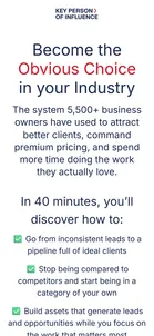
- Dent Global — "Become the Obvious Choice in your Industry" recorded masterclass"In 40 minutes, you'll discover how to…" with a trailer, four founder case studies ("Grew from €20K to €2M in annual revenue within 18 months") and a host bio that leans on podcasts: Diary of a CEO "seven times, more than any other guest in the show's history". Both buttons open the same popup form. The page is the most-advertised single destination in the account, and it is a recording.View asset →
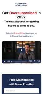
- Dent Global — "Get Oversubscribed in 2027" masterclassA "limited-time masterclass" for "6-7 figure Business Owners", built on the live workshop's template. The seams show: a page about 2027 asks "Is this workshop for you?" and closes on "In 2026, only businesses who know this win". The claim on this one is "5,200+ business owners".View asset →
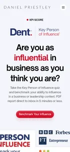
- Dent Global — "KPI Score" page on danielpriestley.com“KPI Score” sits in the main navigation of Priestley’s personal site, between Key Person Of Influence and ScoreApp. The page asks “Are you as influential in business as you think you are?” and promises a “PDF report direct to inbox in 5 minutes or less”. A mock result card shows the five areas the quiz scores (Pitch, Publish, Product, Profile, Partnership) and an overall score of 76%, next to the press logos. The button opens the quiz on Dent’s domain, tagged utm_source=danielpriestley_website.View asset →
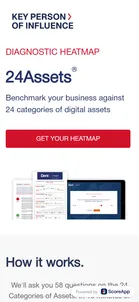
- Dent Global — 24 Assets diagnostic heatmap, on the book’s own siteThe site for Priestley’s book 24 Assets is a second scorecard: “Benchmark your business against 24 categories of digital assets.” “We’ll ask you 58 questions on the 24 Categories of Assets.” The page explains what a business asset is (“anything that would still be valuable if you and your team disappeared”) and then proves it with Key Person of Influence testimonials, not 24 Assets ones. It is the same programme under a different book cover.View asset →
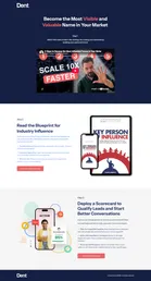
- Dent Global — The resources page: a video, a free book, and ScoreApp“Become the Most Visible and Valuable Name in Your Market”, in three steps. Step 1 is a YouTube video, “5 Steps to Become the Most Influential Person in Your Niche”. Step 2 is a free copy of Key Person of Influence. Step 3 is “Deploy a Scorecard to Qualify Leads and Start Better Conversations”, with a ScoreApp phone mock-up and a “Create Your Scorecard” button. The leads Dent won’t take on a call are sent to the software company Priestley also co-founded.View asset →
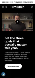
- The Diary Of A CEO — The product page“Set the three goals that actually matter this year. Three questions that turn a vague ambition into something you will still be doing in ninety days.” Below the hero it’s a normal shop product page: a zoomable mock-up of the PDF, 14 star reviews, a reviews carousel and a grid of customer videos of the diary and the cards. The store’s header, cart and “Lock In bundle” announcement bar stay on screen throughout. One of the reviews in the carousel asks for help with rent.View asset →
- The Diary Of A CEO — Behind the Diary: “Join 450K subscribers”The ad’s line as the headline: “Have you ever felt like nobody else thinks the way you do?” Then the promise: “Once a week I write a letter. The things I’m thinking about at 2am, the decisions I’m wrestling with, the stuff I’m figuring out in real time. Straight to your inbox every Sunday.” One field, and the subscriber count on the button instead of “Subscribe”. The background cycles through behind-the-scenes photos.View asset →

- The Diary Of A CEO — DOAC: “Ready to go deeper?”“The newsletter that goes further than the podcast. Episode drops, distilled frameworks, and the takeaways worth keeping.” thediaryofaceo.com is this page and nothing else: the podcast’s own domain is a sign-up form over a looping video. The URL becomes /video?variant=video, and every sign-up is tagged with that variant, so the page is built for A/B tests even though only one version is live.View asset →

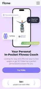
- FitMe — FitMe landing pageSells an "in-pocket coach", not a subscription. Every CTA ("Try FitMe", "Start Wall Pilates plan", "Choose your coach") jumps straight to the quiz — there is no obvious single forward action, and the click leaves the marketing domain (fit-me.app) for the quiz host (quiz.fitme.expert).View asset →
- Flightcast — “Stop guessing what content works.” (/tf)The ad’s landing page is the homepage with the menu taken out. flightcast.com has Pricing, Log in and Watch Demo in its header; /tf has only the logo and one button. Every call to action on the page says “Explore Flightcast” and goes to the same onboarding.View asset →

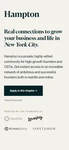
- Hampton — "Real connections to grow your business and life in New York City."One HubSpot page serves every city. A script reads ?city= and writes the city into the title ("Hampton: NYC Founders & CEOs"), the headline, "Connect IRL at Hampton NYC events" and "Apply to the New York City chapter". The member count is part of the same swap, and it shows: New York gets "We've got 220+ founders in New York City", while Tampa and Seattle get "We've got founders in Tampa", with no number. Below a wall of member founders (Morning Brew, Figure, [solidcore], ProfitWell), the application sits on the page itself ("Takes 60 seconds"). It asks for name, email, phone and website, role, revenue band, how tech-enabled the business is, LinkedIn and country, plus an SMS opt-in ("Busy founders forget things"). The revenue dropdown's three sub-$3M options are the ad's three qualifying routes, word for word. The form's five UTM fields are empty, because the ads link with only ?city=. (The black panel below the hero is an embedded Vimeo video that refused to play in the capture browser with "We couldn't verify the security of your connection". Whether real visitors see the video wasn't established.)View asset →
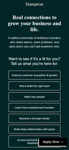
- Hampton — "Real connections to grow your business and life."The page opens on a question rather than a pitch: "Want to see if it's a fit for you? Tell us what you're here for", with seven goals to choose from (customer acquisition, hiring, leadership, meeting people…). Choosing any one of them starts the application. The long page beneath makes the case with member testimonials (Brett Adcock, "Figure AI ($38B valuation)"; the city ads say $39B) and an FAQ that says membership is billed annually and meant to last "a decade or more".View asset →
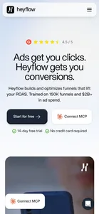
- Heyflow — Homepage ("Ads get you clicks. Heyflow gets you conversions.")An 11,803px page whose hero runs two co-primary CTAs — "Start for free" next to "Connect MCP" — so a marketer and a developer are offered different front doors from the same headline. Risk reversal is stated inline rather than buried ("14-day free trial · No credit card required"), and a G2 rating sits above the headline instead of in a testimonial section further down.View asset →
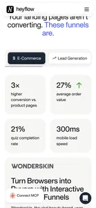
- Heyflow — Tabbed vertical selector"Your landing pages aren't converting. These funnels are." Five tabs — E-Commerce, Lead Generation, recruiting, appointments, app installs — each with its own stat set and named client case. The same personalization goal the sibling funnel spends nine quiz screens achieving, done here with a tab control and no data capture at all.View asset →
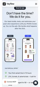
- Heyflow — "Don't have the time? We do it for you."The 72-hour sprint offer surfaced inside the product homepage, sold with a before/after mockup of a client PDP rebuilt as a quiz and a "3x Higher CVR" callout. Notably it routes to the contact-sales flow, not to the dedicated get.heyflow.site/72-hour-unlock page the ads use — the same offer with two different capture mechanisms depending on where you met it. An asterisk footnote discloses the $100K spend floor that the ad-driven version enforces with a quiz.View asset →
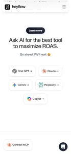
- Heyflow — "Ask AI for the best tool to maximize ROAS"Five buttons deep-linking to ChatGPT, Claude, Gemini, Perplexity and Copilot under the line "Go ahead. We'll wait 😉". Three carry pre-filled favourable queries; the Claude button opens a pre-baked shared conversation rather than a live prompt — a curated transcript presented as an impartial third-party verdict. Third-party AI recruited as on-page social proof, and the contact-sales form completes the loop by listing "AI Chat" as a "how did you hear about us" option.View asset →
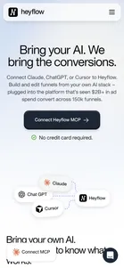
- Heyflow — MCP feature page ("Bring your AI. We bring the conversions.")The competitor named in Heyflow's own attack ads gets reframed as the input. "Your AI builds the page. Heyflow runs everything behind it." — the same vibe-coding tools the ads dismiss ("won't improve your ROAS") become the top of a developer-shaped funnel, with a four-step install path that ends in an OAuth authorization performed inside Claude rather than a form on Heyflow's site.View asset →
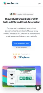
- involve.me — Homepage ("The AI Quiz Funnel Builder With Built-In CRM and Email Automation")Where every Facebook ad lands, and a quiz company's homepage with no quiz, no calculator and no form on it. Every button says "Get started for free" and goes to the sign-up page, even the "Trusted by 4,500+ businesses" badge. The free account is the only thing on offer.View asset →
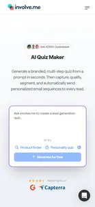
- involve.me — Tool pages from Google (quiz maker, calculator, landing page, form, funnel)Where the Google ads send people: one page per tool. The newest pages all follow one pattern. A "Join 4,500+ businesses" badge, a headline like "AI Calculator Builder With Built-in Email Automation", and, instead of a sign-up button, a box that asks you to describe what you want. The example pages include a working quiz you can try on the spot. Two of these paid pages misspell their own badge, differently each time: "buisnesses" and "buinesses".View asset →
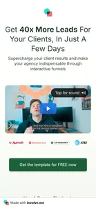
- involve.me — Agency template page ("Get 40x More Leads For Your Clients, In Just A Few Days")Built with involve.me itself, and it still has the "Made with involve.me" badge that paying customers remove, so the page is also a demo of the product. It's short: a video, a "What's included" section, three groups of 👉 bullet points, and the same button twice. There's a typo on this paid page: "a leads price sensitivty".View asset →
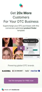
- involve.me — Online-shop template page ("Get 20x More Customers For Your DTC Business")The agency page, copied and not fully rewritten. A heading still says "Your Agency Growth Platform" above points about selling products, and two bullet points are word for word the same as the agency page. Two more typos: "personalises journeys" and "oferring". A template sold on saving you time, on a page that was clearly put together in a hurry.View asset →
- King Kong — E-commerce landing page (not captured)TODO: capture. `go.kingkong.co/ecom` is a distinct page from the quiz at `/strategy` — not walked, but flagged here rather than folded silently into the shared funnel.View asset →
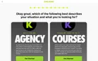
- King Kong — "DO IT FOR ME" (Agency) vs "TEACH ME HOW TO DO IT" (Courses)Also reached on a desktop viewport. Answering the revenue questions at the top of the scale reaches a different final screen instead of a rejection: a choice between hiring King Kong outright ("Agency," 4.6★/607 reviews) or buying a self-serve course ("Courses," 4.8★/6,951 reviews) — a second King Kong product line, entirely separate from the agency funnel this card maps. Both option cards submit to the identical Infusionsoft form endpoint (`wg216.infusionsoft.com/app/form/process/...`) under the hood. Neither "Get Started" button advanced the quiz when clicked — tried as a plain click, a full trusted-event simulation, and a CDP-level click through the browser's own input pipeline, all with no effect. That was the desktop run. Re-walked on a phone on 5 October 2026 ($50k+ budget, $1M current and target revenue), the Agency card's "Get Started" worked with a real click and led on to three more questions and a details form; the Courses card was not tried on a phone, and the desktop failure was not reproduced there or re-tested.View asset →
- Marketing Secrets — "Cancel Claude & ChatGPT", Marketing Secrets AI sign-upWhere the challenge domain goes today. aisecretschallenge.com redirects to the Marketing Secrets AI sign-up page: "Free for 14 days. Just $97/month after". The challenge is over, but the ads' traffic and the domain were kept, and both now point at the subscription the challenge was presumably selling. The headline goes after the general-purpose tools by name, and the pitch is that one flat fee replaces "the $200+/mo of juggling separate AI subscriptions".View asset →

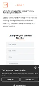
- NP Digital — "We make sure you show up everywhere, from Google to ChatGPT"The non-local-service ads — AI-search anxiety, e-commerce, general "NP Lead Engine" pitches — all end on this same page. There's no free tool, no lead magnet, no price anywhere: the whole page is one form ("Let's grow your business together") asking for name, email, website, monthly marketing budget and phone, gated behind "Book a call". The budget field is the qualifier, the same mechanic as a coaching funnel's "apply now" — it screens leads before a human ever talks to them.View asset →
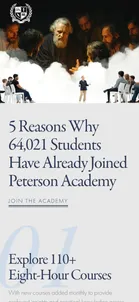
- Peterson Academy — “5 Reasons Why 64,029 Students Have Already Joined”The page most of the ads point at (159 found). A listicle with five numbered reasons (110+ courses, professors from MIT, Harvard and Oxford, a community, mobile, and a 7-day money-back guarantee), then a single price card: $500 a year, “less than the cost of a single college class”. No nav, three “Join the Academy” buttons, each tagged for the checkout (from=listicle-hero, landing-enrollment-card, listicle-footer). The headline number is live: it read 64,029 on the first visit and 64,021 an hour later, so it counts current members and falls as people leave.View asset →
- Prime Mover — "Your FREE copy of Expert Secrets"The free-plus-shipping funnel Brunson made famous. The book is "Only $609.95 FREE Today!": the price is the 384-page book plus five bonuses "worth $585" (Expert Evolution, Hook Story Offer, the Perfect Webinar slides, the 5 Minute Perfect Webinar and a 30-day challenge), and you pay $9.95 shipping in the US or $19.95 abroad. The order form sits above the fold, asking for name, email and phone, with consent to autodialled calls and texts, before a long letter "From: Russell Brunson, Boise, Idaho" makes the case. The footer is Prime Mover's, not ClickFunnels'.View asset →

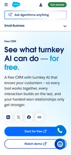
- Salesforce — “See what turnkey AI can do — for free.”“A free CRM with turnkey AI that knows your customers.” Two buttons, “Start for free” and “Watch demo”, then straight into a three-plan price table, four feature cards and a customer quote with a “Get free CRM” button. A few seconds after load an Agentforce chat panel opens by itself, “Need help? Ask Agentforce.”, and its first suggestion is “Connect me with a sales rep”. The page keeps the full site header, and the header’s green “Get started” doesn’t go to the free plan at all (see the last step).View asset →
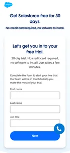
- Salesforce — “Get Salesforce free for 30 days.”A campaign page with no site nav: just the logo, “No credit card required, no software to install”, five ticks (up to 10 users, guided onboarding, sales, service, email marketing and commerce in one place, AI drafting, a free Slack workspace), three G2 badges, a phone number and the form. The report pages Salesforce advertises keep the full nav; this one has nowhere to go but the form. Google Search sends people here too, on the term “salesforce contact management”.View asset →
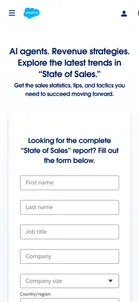
- Salesforce — “AI agents. Revenue strategies.”One screen: the pitch on the left, the form on the right, the footer underneath. Three statistics stand in for a table of contents (“Why 94% of sales leaders say agents are essential to growth”) next to a 3D render of the report cover. On a phone the statistics and the cover are dropped, and the page opens on the headline and the form. The full site nav stays, including Login and a green “Get started”.View asset →
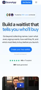
- ScoreApp — "Build a waitlist that tells you who'll buy"One of four pages built from the same template: a headline for one job, "No credit card required", a Trustpilot rating of 4.8, "5M+ leads generated", a video, the problem, three steps, the AI builder, a comparison table, testimonials and an FAQ. Every button goes to the same sign-up. One slip: the page's browser title is the scorecard-marketing page's ("Scorecard marketing: turn traffic into leads"), so the tab and a search result describe a different page.View asset →
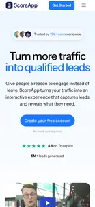
- ScoreApp — "Turn more traffic into qualified leads"The same template, with the job set to lead generation and the button "Create your free account". The Pat Flynn ad lands here.View asset →
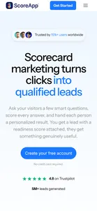
- ScoreApp — "Scorecard marketing turns clicks into qualified leads", with the bookThe one page in the set with an extra offer. A section headed "Daniel Priestley wrote the book. We built the platform" adds a second button, "Create your free account + get the book", and promises "Create your free account and we'll send you a copy". A free software plan comes with a physical copy of the co-founder's book, so the book becomes a reason to sign up, and its reader is already using the product it describes.View asset →
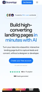
- ScoreApp — "Build high-converting landing pages in minutes with AI"The template again, this time for the AI page builder. It is the page furthest from scorecards, written for someone who came to build a landing page and is shown everything attached to it.View asset →
- Tony Robbins — "Tony Is Celebrating 35 Years of Awaken the Giant Within by Giving You the Book—Free."Robbins' version of the free-plus-shipping book: "Just cover shipping while copies remain." The scarcity is the whole page. A top bar reads "ADDITIONAL COPIES RELEASED—ONLY A FEW FREE COPIES REMAINING", and the story beneath the buttons is "WE GAVE AWAY EVERY COPY WITHIN 2 DAYS OF RELEASE, BUT TONY DECIDED TO MAKE A FEW MORE AVAILABLE", on a page whose ads have been running since June. Five buttons ("Claim Your FREE Copy", "GET MY FREE BOOK NOW", "YES—SEND ME TONY'S GIFT") all open the same tonyrobbins.com order-form widget, the one the $97 programs embed, which stays hidden until a button is pressed. The copy answers "Why Is Tony Giving This Away?" with the anniversary, and says the profits go to research and 20 million meals through Feeding America.View asset →

- Tony Robbins — "Reach Peak Business Performance With the World's #1 Coaching System"Built on the Results Coaching page: the same headline with "Business" inserted, the same background video, the same "Don't compete without a coach", and the same three-step "How it works" ending in "discover how Tony Robbins Business Results Coaching can help you". Every button reads "Get a Free Business Strategy Session". The business version adds a FAQ ("Is business coaching for entrepreneurs?") and six outcome tiles, from Increase Revenue to Overcome Challenges.View asset →
- Tony Robbins — "Drive Explosive Growth"Business Mastery, January 13–17 2027, virtual. The page promises "Tony Robbins' proven systems that have helped thousands of 6, 7, and 8-figure businesses grow exponentially". It runs through six benefit tiles, video testimonials and revenue stories ("grew 10-fold in revenue in a year", "growing my portfolio to $142 million"), and asks the reader to "Become a owner, not an operator". Every button reads "APPLY NOW". There is no price, and the application form asks for a country from a full international list. The ads started the week this was captured, three and a half months before the event.View asset →
- Tony Robbins — "Create life according to your terms"Date With Destiny, December 4–9 2026, "Virtual & West Palm Beach, FL". The page makes the case with a Stanford Snyder Lab study (50% more positive emotions a month later, 70% fewer negative ones), a six-day agenda and video testimonials, and never names a price. Every button ("Decide My Destiny", "Get More Details Now") leads to one form: "Enter your information below to explore Date With Destiny ticket options." Underneath it, an embedded Calendly offers "a quick call with a member of our team" for anyone still unsure. The ads started in February for a December event, so this page is collecting leads for ten months.View asset →

- Tony Robbins — "Build Lasting Love: Master the hidden patterns that shape your relationships"The pitch is "patterns": whatever the relationship problem, "the answer is always the same". Every button reads "Get a complimentary session", and the three steps are claim the session, "get matched with a coach", transform your relationship. The testimonials are couples' stories ("Days of Silence", "Separated and Pregnant"). The results block is copied from the other coaching pages, so a page about love leads with "81% improved their time management skills". The same "patterns" pitch is sold for $97 as the Ultimate Relationship Program, which the ads here never mention.View asset →
- Tony Robbins — "Reach Peak Performance With the World's #1 Coaching System."The URL says "gift", and the gift is the first session. Every button reads "Get a Free Coaching Session", and "How it works" describes that session in three steps: get clear on what you want, discover what's holding you back, then "learn how Tony Robbins Results Coaching can help you", which is the pitch. No price is given for the coaching itself. The results block ("81% improved their time management skills · 63% experienced improved relationships…") appears word for word on the Relationship and Business Coaching pages. The form asks for consent to "emails, phone calls and SMS messages" from Robbins Research International.View asset →
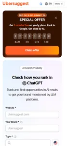
- Ubersuggest — "Check how you rank in ChatGPT"The ad lands inside the full Ubersuggest app shell, not a standalone page — sidebar navigation, account menu and all — with a free "Website / Your Brand / Topic" form usable before signing in. Framed on both sides by pressure to convert: a live countdown banner above the tool, and a "Create a FREE account" popup listing what an anonymous user is missing.View asset →
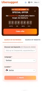
- Ubersuggest — Keyword Discovery ToolSame app shell, same countdown banner, same account-creation popup as the AI-visibility tool — only the page title and the one free form (keywords in, search volume/trends/difficulty out) change.View asset →
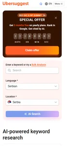
- Ubersuggest — AI-powered keyword researchThe "AI Visibility Tracker" from the ad is this page's "AI-powered keyword research" panel — search volume, difficulty and backlink data alongside an "AI prompts and responses" module. Same shell, same banner, same popup again.View asset →
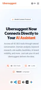
- Ubersuggest — Ubersuggest MCP ServerThe one destination that isn't the app shell — a standalone developer-marketing page pitching "42 SEO tools through natural conversation" via Claude, Cursor, Windsurf and other MCP clients, with a live chat-transcript demo and setup instructions. Ends on the same "Start 7-day free trial" CTA as everything else.View asset →
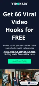
- Vidonary — “Get 66 Viral Video Hooks for FREE”“Answer 3 quick questions, and we’ll send you the hooks plus 66 real examples”, plus a free PDF of Content Fortress. The only testimonial is Priestley’s own: “We went from 5k Views per month to 5 Million Views Per Month”, signed Daniel Priestley, Dent Global. The co-founder is the proof.View asset →
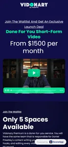
- Vidonary — Vidonary Premium: “Done For You Short-Form Video, From $1500 per month”“Only 5 Spaces Available.” “Vidonary Premium is a done-for-you service. You will have the same team that is responsible for Daniel Priestley’s content writing your scripts, crafting your hooks, and editing every video. All you have to do is hit record.” The launch deal for the first five: 20% off, a free gear pack and a year of the app. The page positions Premium as the next step up from the app: “Vidonary gives you the platform. We give you the team.”View asset →