Quiz/survey examples
Real-world Quiz/survey examples pulled from complete funnels, each in the context that makes it work.
16 examples
- Acquisition.com — Personalised-roadmap quiz (six screens)A HubSpot form dressed as a quiz: one question per screen, and the line "Free. Takes about 30 seconds." under the button. The first screen asks only for a name, which is the cheapest commitment available; the phone number and a shipping address come before any question about the business. The consent line beneath the form says the details may be used for calls, texts and email "using automated telephone dialing systems and AI". The last screen is the one that matters: six dropdowns — employees, revenue, margin, ownership, how long you have followed Alex, industry — and the revenue answer alone picks the next page.View asset →
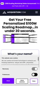

- Acquisition.com — Four-screen kit formA custom wizard, not the HubSpot embed the Roadmap uses, with five answers on the last screen. The first screen asks only for a name, the second for an email, the third for a phone number, and only then comes the screen that sorts the visitor: employees, annual revenue, ownership, how long they have followed Alex, industry. Unlike the Roadmap there is no address screen. The same two answers, revenue and ownership, decide the next page.View asset →
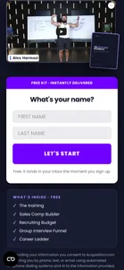
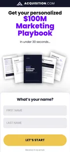
- Acquisition.com — Marketing Roadmap wizardA wizard like the main Roadmap's: first a name (LET'S START), then a business email, then a phone number. The country picker defaults to US +1 here. Under the form: "Receive it via email.", "Same playbook we use in our $250M+ portifolio companies." (sic) and "Requested by 250,000+ business owner." (sic). Its field list also names employees, annual revenue and ownership, which come after the phone screen. The phone screen validates the number, and the walk stopped there, so the qualifying questions and anything after them are not captured.View asset →
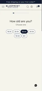
- Blueprint — Protocol quiz (11 screens, Okendo)Eleven screens that auto-advance on tap, opening with the least sensitive question available and never asking for anything identifying until the very end. Two things make it worth studying. First, the personalization is real: walking two disjoint personas returned overlapping-but-different baskets, and re-walking one from a clean browser context returned an identical result, so the engine is rule-based rather than decorative. Second, sex at birth is a router — answering Female inserts two screens (pregnancy, menopause) that the male path never sees, and answering yes to pregnancy produces a liability disclaimer rather than a disqualification. The funnel never turns anyone away.View asset →
- Dent Global — The scorecard: about thirty scored questions, then six that sort youOne question per screen with three answers each, starting with “Do you have an inspiring origin story and mission that attracts the right people?” Around the 64% mark the questions stop being about influence and start being about the buyer: industry, how well they know the KPI method, revenue, biggest obstacle, whether they want outside help, and whether they can pay for it. Those last six questions decide which of the results pages below a visitor reaches. Answering “Under 100K” to revenue adds a separate set of questions that nobody else is asked.View asset →

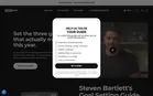
- The Diary Of A CEO — “Help us tailor your guide”Two more screens inside the same modal, framed as personalising the PDF: “To unlock the guide, tell us what you’re most interested in.” The answers are list segmentation. Interests cover the podcast’s topics (business, money, health, relationships, mindset, tech), and the role question asks for the visitor’s job.View asset →
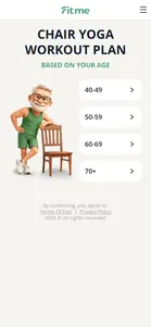
- FitMe — 34-question personalization quizThe engine of the funnel. Thirty-four light taps build sunk-cost commitment while collecting the inputs (goals, body, habits, height/weight/age) that the paywall feeds back as a "personalized plan". Reassurance interstitials are threaded between question blocks to sustain momentum, and the numeric answers drive a computed BMI reveal near the end.View asset →
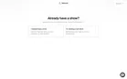
- Flightcast — “Already have a show?”The first question splits two buyers. “I already have a show” promises that moving over “keeps its ratings, reviews and followers”, the main fear of switching hosts. “I’m starting a new show” goes straight to setting one up.View asset →
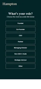
- Hampton — Five questions, then contact detailsA ClickFunnels quiz (the form fields are named cf-quiz-7403632, while the rest of Hampton runs on HubSpot) with one question per screen: goal, role, revenue/funding/exit status, country, city, then "What's your contact details?". The revenue question is the qualifier, but it doesn't branch. Answering "$0-$999,999" leads to exactly the same next screens as "$5-10M", and every path ends at the same name, email, phone, website and zip form. So nobody is turned away before they give their phone number, and any vetting happens afterwards, by Hampton. The city list is also out of date: sixteen cities plus "None of the above", with no Seattle or Tampa, both of which now have their own ads.View asset →
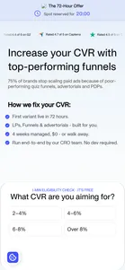
- Heyflow — "1-min eligibility check" (9 screens)Framed as a free assessment the visitor receives, while functioning as a hard budget gate Heyflow applies. The first question sits inside the landing screen itself — there is no "start the quiz" click to lose people on — and a "Spot reserved for 20:00" countdown starts the moment the page loads. Two screens in the middle are not questions at all but a proof interstitial and a competitor comparison, inserted once four answers of sunk cost are already banked.View asset →
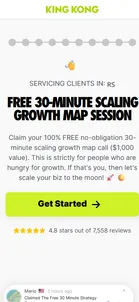
- King Kong — "Free 30-Minute Scaling Growth Map Session"The page sells a free 30-minute strategy session, but "Get Started" does not open a calendar. It opens a quiz, one question per screen with progress dots along the top: your name, your email, what you sell, which marketing you already use, your country, your monthly ad budget, your website, your current and target revenue, your biggest obstacle and your timeline. Each answer is small, and by the end King Kong knows whether you are worth a call before you have asked for one. The page works hard to keep you going. It names the country it thinks you are in ("Servicing clients in…"), a live toast keeps announcing that someone else has just claimed a session, and an exit popup ("Hold up there, tiger") waits for anyone who tries to leave. That toast has a cost on a phone: on the marketing-channels question it sits over the Continue button for about two seconds in three, and a tap while it shows does nothing. The slides follow the quiz to its fork between hiring the agency and buying a course, and on to the details form that asks for a phone number before the calendar.View asset →
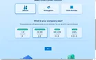
- Salesforce — Two clicks: what you use, how big you are“Close more. Grind less.” Step 1 of 2 asks for the current solution (Manual, Homegrown, Other Provider) and a company-size band, then “Next”. No numbers to type: “Pre-populated data will appear based on your selections.” The calculator is a Squirrel365 embed inside the Salesforce page.View asset →
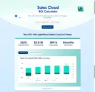
- Salesforce — 282% ROI, 8-month payback“Your ROI with Agentforce Sales Cloud in 5 Years”: 282% expected ROI, $2.51M net benefit, $891k investment, 8-month payback, with a five-year chart. Below it, ten inputs arrive already filled in (25 users, $22,000 average order, 27% win rate, 14,000 accounts a year, $110,000 per employee) and six value drivers, each a product feature with a percentage and a dollar figure (rep productivity +12% = $440k, sales cycle –10% = $102k…). Every number can be edited, but nobody has to. A “Download the report” button sits above the results; the page ends with “Start your trial”, “Talk to an expert” and “Stay up to date”.View asset →
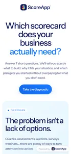
- ScoreApp — "Which scorecard does your business actually need?" diagnosticEvery campaign page, the homepage and the pricing page link to this seven-question quiz for visitors who aren't ready to sign up. It promises to tell you "exactly what to build" and which plan to start on "without overpaying". It is built in ScoreApp, so it shows the product working, and it also sorts visitors by plan. The first question asks for your biggest marketing or sales need, and its six answers match the jobs the campaign pages are written for: attracting leads, qualifying them, research, launching a waitlist, events and webinars, and website enquiries. Questions two to seven and the recommendation are still to be captured; the quiz is behind a captcha that needs a person.View asset →
- Vidonary — Email, then three questionsThe email comes first (“Enter your details below to access your 66 Viral Hooks”), then three questions. The first two are about the visitor’s goal and what holds them back. The third asks them to say they need the product: “Would you benefit from a tool that lets you plan and record videos faster?”View asset →

- Vidonary — The waitlist applicationA waitlist that asks six questions: goal, how often you post, team size, biggest challenge, whether you are already a paying Vidonary customer, and anything else. It doesn’t ask about budget. A $1,500-a-month service filters on team size and how much video you already make, and leaves the money conversation for later.View asset →